See a different world.
Switch between Equal Earth, Robinson and Mercator. Find a country and see how its place on the map changes.
Start exploringExplore an equal-area world map, compare countries, and see what every projection changes.
Switch between Equal Earth, Robinson and Mercator. Find a country and see how its place on the map changes.
Start exploringHow does Africa compare with Greenland? Explore country comparisons built from the same boundary data.
Compare Africa and GreenlandChoose a projection, highlight places and download a map for your next lesson, presentation or project.
Open the map makerEqual Earth keeps the relative sizes of countries and continents in proportion. Shapes change, but a place with twice the area still takes up twice the space.
It is one way to see the world. Understanding what each projection preserves helps you choose the right map for the question.
Get to know Equal EarthAn Equal Earth map represents the curved surface of the Earth on a flat page while keeping areas in proportion. If one region covers twice as much of the globe as another, it covers twice as much space on an Equal Earth map drawn at one scale. The same rule applies to countries, continents, oceans and regions crossing the equator.
The word “equal” describes this relationship between geographic area and map area. It does not mean that all countries look equally large, that every outline has its original shape, or that every map measurement is correct. Large places remain large. Small places remain small. What disappears is the systematic enlargement of high latitudes familiar from Mercator world maps.
Equal Earth belongs to a family called pseudocylindrical projections. Its parallels of latitude are straight, horizontal lines. Most meridians curve toward the edges, and the central meridian is straight. The resulting world has rounded sides and short lines at the poles. Those choices give the whole globe a finite, broad frame that works well on a screen, in an atlas or on a wall. The Equal Earth reference explains its equations and area-preserving geometry.
Many people’s mental picture of the world comes from a rectangular Mercator map. In that view, geographic regions become progressively larger on the page as they approach either pole. Greenland, northern Canada, Russia and Antarctica can therefore occupy much more visual space than their geographic areas would suggest.
Equal Earth redistributes that space. Africa and South America tend to look more prominent; Greenland appears much smaller. Nothing has changed about the land itself. The projection has changed the rule for turning positions on the globe into positions on the page.
Africa and Greenland make the difference especially clear. In the versioned boundary model used here, Africa covers about 29.95 million square kilometres and Greenland about 2.14 million. Their ratio is about fourteen to one. On a shared-scale Equal Earth map, Africa’s filled outline therefore occupies about fourteen times Greenland’s area. Their widths and heights do not have to follow that ratio: area is a two-dimensional quantity, and the outlines have different shapes.
This distinction matters whenever the visual size of a place carries meaning. A world map in a classroom can influence a reader’s sense of how much land lies in different regions. A map of forests or agricultural land can make high-latitude regions look disproportionately extensive if area distortion goes unexplained. Equal Earth gives those comparisons a consistent area basis.
It shows true relative area within the geographical model and boundaries supplied to it. That qualification is useful. A flat world map cannot simultaneously preserve every area, every angle, every shape and every distance. Equal Earth prioritizes area and accepts changes to the other properties.
A coastline may look wider, narrower or more tilted than it does on a globe. A straight ruler laid between two cities does not become a reliable global distance measure. Equal Earth is also not a three-dimensional globe flattened without damage. The surface has been mathematically rearranged so that area relationships survive the flattening.
“True size” can also refer to several different statistics. Official land area often excludes inland water; surface area may include it. The treatment of islands, overseas territories and boundary features also affects the number. A projection cannot resolve those definition choices. Two websites can both use an equal-area map and still report different country areas because their underlying data represent different scopes.
The area figures on this site come from Natural Earth boundary polygons measured on a sphere of radius 6,371 kilometres. They are useful for consistent comparisons, but they are not presented as official national land-area statistics. The important comparison is made from the same geometry and model on both sides.
| Projection | Its main priority | What a world-map reader should remember |
|---|---|---|
| Equal Earth | Preserve relative area | Shapes and angles change, especially away from the centre. |
| Mercator | Preserve local angles | Areas become much larger toward the poles, which cannot be shown at finite distance. |
| Robinson | Balance the appearance of the whole world | It preserves neither area nor local angles exactly. |
Mercator’s area enlargement follows a precise rule on a sphere. Relative to its equatorial scale, a very small patch at latitude 60° occupies four times as much map area as an equally large patch at the equator. At 80°, the factor is about 33. A large country spans many latitudes, so no single one of these factors describes its entire outline.
Robinson softens the polar enlargement while maintaining an appealing world outline. Equal Earth was inspired by Robinson’s appearance, but it adds the mathematical guarantee of area preservation. The two can look similar at first glance. Their difference becomes clearer when equal-sized geographic regions are placed at several latitudes.
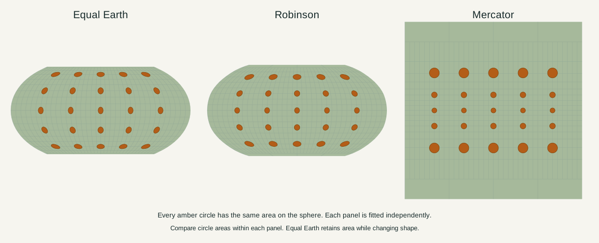
The amber circles in this figure all cover the same area on the sphere. Compare their sizes within each panel; the panels have been fitted independently. In Equal Earth, the circles change shape while retaining equal area. In Mercator, they remain approximately circular at this small scale but grow toward the poles. Robinson makes a different compromise between those effects.
Imagine stretching a small square into a rectangle twice as wide and half as high. Its shape changes, but its area stays the same. Equal-area projections use a related principle continuously across a curved surface: stretching in one local direction is balanced by compression in another.
The actual geometry is more complicated than stretching a sheet by hand. Longitude lines converge on a globe, and a degree of longitude covers less ground near a pole than it does at the equator. Equal Earth’s equations account for that shrinking width when deciding where each latitude line lies and how wide it should be.
Mathematically, its local map-area factor matches the surface-area factor of the sphere. Adding those tiny preserved areas across a country preserves the country’s total area too. This is why the guarantee applies to whole regions, rather than merely making a few example countries look plausible.
The guarantee survives ordinary map composition choices. Rotating the globe to a different central meridian does not alter geographic area. Turning the finished map south-up does not alter it either. Stretching the image more in one direction than the other does change shapes further; a uniformly resized copy keeps the intended geometry and area ratios easiest to interpret.
Bojan Šavrič, Tom Patterson and Bernhard Jenny designed Equal Earth in 2018. Their paper was published online in August that year and appeared in the 2019 volume of the International Journal of Geographical Information Science. Both dates appear in references for that reason.
The authors wanted an equal-area world projection with an approachable appearance and practical equations. Its shape drew on Robinson, a familiar world-map design. The project emerged from a wider discussion about the way school maps represent country and continent sizes; it was not invented by a recent map campaign or by this website.
Equal Earth Lab is an independent site using the projection. Equal Earth is also distinct from Natural Earth: the former is a mathematical projection, while the latter supplies the boundary and terrain datasets used in these maps. A mapmaker can use Equal Earth with other geographic datasets, or use Natural Earth data with a different projection.
Equal Earth is particularly useful when geographic extent is central to the message. Examples include comparing country areas, displaying the distribution of land cover, presenting world geography, and mapping a variable whose coloured regions should retain their relative footprint. Its complete world outline also makes it useful for general reference maps.
Area preservation does not by itself make a statistical map fair or clear. Colour choices, class boundaries, missing observations and the distinction between totals and rates still matter. A map of total population answers a different question from a map of population density even when both use the same projection.
For navigation, local engineering or precise distance measurement, other priorities take over. Mercator has a specific relationship to constant-bearing routes. Local surveys need an appropriate coordinate system and a more detailed Earth model. A world equal-area projection should be chosen because area is important to the task, rather than because one projection can be best for every purpose.
It is accurate for relative area. “Most accurate” needs a named measurement: area, angle, distance and shape are different properties. A map can improve one while changing another. Equal Earth’s value is that its area promise is explicit and testable.
Compared with many familiar Mercator world maps, Africa receives more of the page relative to high-latitude land. Its geographic area has not increased. The change corrects the comparison of map areas rather than adding land to Africa.
The South Pole is represented by a line in this projection. Geographic features very close to it spread across that line. Antarctica keeps its relative area, but its shape changes substantially. An equal-area world map is not a substitute for a dedicated view of the polar region.
Yes. A projection can position terrain imagery as well as political boundaries. Mountain shading, ocean-floor colours, labels and borders are separate design layers. Their appearance depends on the chosen data and styling; the projection controls where they go.
No. North-up is a convention. A south-up Equal Earth map keeps the same area relationships, and a different central meridian can place the Pacific or another region at the centre. These choices change emphasis and the position of the map’s cut, while the equal-area property remains.
Map calculations use the fixed dataset described in our methodology.