Africa vs Greenland: a fourteenfold difference
Africa has about fourteen times Greenland's area in our boundary model. The surprise comes from seeing an Arctic island and an equatorial continent on a map that enlarges the far north.
Africa is 14.01 times the boundary-model area of Greenland.
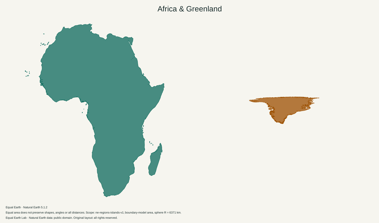
| Place | Boundary-model area estimate |
|---|---|
| A · Africa | 29,948,465 km² |
| B · Greenland | 2,137,884 km² |
Both silhouettes use one shared Equal Earth scale. Moving a silhouette here is a flat cutout comparison; it does not relocate the place on the globe. Shapes still reflect projection distortion. Try spherical relocation
On the silhouettes above, Greenland occupies roughly one fourteenth of Africa’s filled area. That is a much wider gap than their familiar appearance on many rectangular world maps suggests. In this site’s calculation, Africa covers 29,948,465 km² and Greenland covers 2,137,884 km². Dividing the first by the second gives 14.01.
The useful answer is “about fourteen times.” It does not mean fourteen Greenland-shaped pieces will tile Africa without gaps. That would be a packing problem involving coastlines and orientation. The area ratio tells us how much surface each place occupies, regardless of how neatly their outlines fit together.
The extra space comes from latitude
Mercator spreads the parallels farther apart as they approach the poles. At the same time, its map scale increases east to west. Those two changes preserve angles locally, which is useful for bearings, but multiply the apparent area of high-latitude land. The Mercator projection reference describes this tradeoff.
For the spherical Mercator used here, local area enlargement relative to the equator is 1 / cos²(latitude). Applying that formula to a very small patch gives:
| Latitude of a small patch | Apparent area relative to the same patch at the equator |
|---|---|
| 0° | 1× |
| 60° | 4× |
| 75° | About 14.9× |
These are calculations for small patches, not country-wide correction factors. Greenland extends across many latitudes, so its northern coast is enlarged more than its southern tip. Dividing an entire Greenland image by the value at its centre would miss that variation.
Africa straddles the equator. Greenland sits far north of it. Putting both on Mercator therefore gives Greenland a much larger visual boost. Changing to Equal Earth restores the area relationship, although individual coastlines still change shape when the globe is flattened.
Ice makes Greenland look different again
In a physical map, much of Greenland appears white while large parts of Africa appear green or tan. The white interior is still part of Greenland’s area. It must not be treated as empty map background. NASA’s satellite view of southern Greenland describes an ice cap covering about 81 percent of the island and shows the exposed coastal margin.
Africa’s colours also deserve a closer look. The Sahara, the semi-arid Sahel and the Congo rainforest occupy different parts of the continent. NASA’s Sahel vegetation observations show how plant cover in the belt south of the Sahara responds to rainfall. A single coloured silhouette deliberately sets those differences aside to answer one question about total area. It cannot tell us how much of either place is farmland, forest or ice-free ground.
Move Greenland toward the equator
Open Greenland on the world map, choose Compare with this country, and drag the copy toward central Africa. On Mercator, it becomes smaller on screen as it leaves the Arctic. Watch the area value: it stays the same throughout the movement.
Then select Equal Earth and repeat the move. Its shape can change, but the area represented by the copy stays consistent with the map’s scale. This is the distinction behind “true size”: an equal-area map preserves area proportions, while every flat world map still distorts something.
The Africa figure on this page includes Madagascar and the other mapped islands assigned to Africa in our physical-continent scope. Greenland is counted separately from Denmark. Both measurements come from the same versioned boundary model, so the methodology is the place to check the calculation before combining these figures with a statistical table from another source.
Sources & further reading
Map calculations use the fixed dataset described in our methodology.