Equal Earth vs Robinson: similar outlines, different promises
Equal Earth and Robinson both give the world a broad, rounded frame. Equal Earth preserves relative area; Robinson balances the appearance of the whole map without preserving area or local angles exactly.
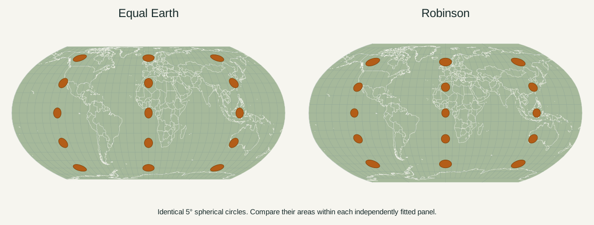
The difference that a rounded outline can hide
Equal Earth and Robinson are easy to confuse at a glance. Both have straight horizontal parallels, curved outer meridians and finite lines at the poles. Both keep the entire world within a compact frame. Neither displays the extreme, unbounded polar stretching of Mercator.
The resemblance is intentional. Equal Earth’s authors describe an overall shape inspired by Robinson, with the additional requirement that geographic areas stay in proportion. The question is therefore more useful than “Which one looks like a world map?” Both do. The question is what you need the size of a coloured region on that map to mean.
| Property | Equal Earth | Robinson |
|---|---|---|
| Equal-area | Yes | No |
| Conformal: preserves local angles | No | No |
| Whole globe within a finite frame | Yes | Yes |
| Parallels | Straight horizontal lines | Straight horizontal lines |
| Outer meridians | Curved | Curved |
| Main design priority | Area preservation with a readable world outline | A visual compromise among distortions |
| Strong reason to choose it | Geographic extent is part of your argument | A general overview with familiar, balanced outlines |
These are projection properties, not differences in the countries themselves. The comparison figure uses identical Natural Earth boundaries in both panels.
What “compromise” means in Robinson
A compromise projection accepts changes to several properties in exchange for a useful overall picture. Robinson does not promise exact relative area, local angles, general distances or directions. Its strengths are judged in relation to a world-map task and the appearance of the resulting geography.
Arthur H. Robinson developed the projection in 1963 for Rand McNally. Esri’s documentation describes a design developed graphically, rather than beginning with an equation chosen to enforce a single invariant. Its projected parallel lengths and vertical positions can be represented by a table; software interpolates between the listed latitudes. Equal Earth, introduced in 2018, uses equations that enforce area preservation while pursuing a broadly similar frame.
“Compromise” does not mean that Robinson somehow preserves half of every property, or that its error is evenly distributed. A region can look convincing while its area is enlarged. Equally, a shape may look more stretched on Equal Earth precisely because area has been kept from growing. Looking natural and preserving a specific measurement are separate tests.
How much does area change?
The table below compares tiny patches at different latitudes. Each projection’s local area scale at the equator is normalized to one. Values greater than one mean that a patch receives more display area than an equal-sized equatorial patch in the same projection.
| Latitude | Equal Earth | Robinson |
|---|---|---|
| 0° | 1.00× | 1.00× |
| 30° | 1.00× | 1.11× |
| 45° | 1.00× | 1.25× |
| 60° | 1.00× | 1.46× |
| 75° | 1.00× | 2.02× |
| 80° | 1.00× | 2.45× |
Calculated on a sphere at the central meridian using the site’s projection functions. These describe tiny patches, not average distortion across an entire country. Robinson values depend slightly on the interpolation used.
In this implementation, a small patch at 60° receives about 1.46 times the projected area of an equal patch at the equator on Robinson. At 80°, the factor is about 2.45. Equal Earth remains at one. Robinson’s enlargement is far smaller than spherical Mercator’s factors of four and about 33.16 at those latitudes, but it is still large enough to change the visual balance of a world map.
These are calculations from the site’s projection functions. The Robinson values use D3’s table interpolation and numerical derivatives; they are not official country-area statistics or a universal accuracy score. Other interpolation methods can produce slightly different local values. A country crossing many latitudes also cannot be assigned the factor at its centre as an average for its whole outline.
Consider two tiny, equally sized study areas: one near the equator and one at 60° north. A reader judging their coloured footprints on Robinson would see the northern study area occupying roughly 46% more space. Equal Earth removes that latitude-based area difference. This matters if the figure is explaining habitat extent, land cover or the relative geographic reach of two study regions.
Why changing shape can preserve area
An area-preserving transformation can stretch a shape sideways and compress it vertically. Doubling a rectangle’s width while halving its height changes its outline but keeps its area. Equal Earth’s changes vary across the globe, but the same balance applies locally.
On a sphere, a tiny longitude–latitude patch has area proportional to
cos(latitude). Equal Earth’s projected area element contains the same factor,
so its map-area-to-sphere-area ratio stays constant. The Equal Earth reference
works through the determinant that establishes this result.
For a pseudocylindrical projection, we can write the basic structure as
x = λ f(φ) and y = g(φ), omitting an overall radius and display scale. Its
local area factor is proportional to:
f(latitude) × g′(latitude) / cos(latitude)Equal Earth’s functions make that expression constant. Robinson’s tabulated width and height functions do not impose that condition. This explains why two maps with similar silhouettes can have different area behavior: the exact spacing of their meridians and parallels matters, not just the outer frame.
Neither map preserves every local angle. The amber circles in the figure become ellipses or more visibly distorted finite shapes. Compare their areas, rather than using their width or height alone as a substitute for area.
Greenland, Africa and the problem with separate fitting
Greenland and Africa make a useful practical check because much of Greenland lies at high northern latitudes, while Africa spans the equator. On Robinson, their visual area ratio differs from their spherical area ratio. On Equal Earth, a correctly rendered map at one scale retains the ratio from the source geometry. Our dedicated comparison explains the roughly fourteen-to-one relationship in this site’s boundary model.
There is a second issue that the choice of projection cannot solve. If someone cuts out each country and enlarges both to fill identical boxes, the resulting silhouettes no longer share a scale. Even an Equal Earth outline can then suggest the wrong comparison. For separate country illustrations, use a common scale and disclose the scope represented by each outline.
The world maps on this page are fitted independently to make both readable. Judge relative regions within each panel, or use the numerical table. Do not measure one country in the left panel against a different country in the right panel and assume those pixel areas are comparable.
Which one belongs in your map?
Choose Equal Earth when geographic area is part of the message. Examples include comparing continental extent, showing the amount of land within mapped zones or explaining why high-latitude regions appear oversized in other projections. Its area guarantee gives the reader a consistent basis for interpreting the space occupied by a region.
Robinson remains a reasonable choice for a general world overview when you value its particular balance of outlines and can explain its limitations. Using it for a location map is a different decision from using the apparent footprint of a country as evidence about that country’s size. A familiar frame is useful, but it does not supply a quantitative guarantee.
For statistical maps, neither projection fixes the choice of variable. A map of total population and a map of population density answer different questions. Small countries, missing observations and colour classifications still need careful treatment on an equal-area map. Projection choice is one part of a clear argument, alongside the data and its visual encoding.
If the task requires preserving local angles or explaining constant bearings, neither Equal Earth nor Robinson supplies that property. The Equal Earth vs Mercator comparison explains the different tradeoff involved.
Compare them without changing the geography
Open the world map, select a place and switch between Equal Earth and Robinson. Keep the same central meridian and orientation while comparing their outlines. Try Greenland, then a place closer to the equator. Changing the map’s centre moves the cut and changes some shape distortion; it does not turn Robinson into an equal-area projection.
In the map maker, use the presentation comparison template with Equal Earth and Robinson to create a paired SVG or PNG. The two panels fit independently. Include an explanation of what is being compared when you use the image in a presentation.
Is Equal Earth simply a newer Robinson?
It is a distinct projection with a related visual ambition. The important change is the exact area constraint, not the date on which the map was designed.
Does Robinson preserve the true shape of countries?
No. Robinson is not conformal, and neither a recognizable silhouette nor a low distortion near one point guarantees the shape of a large region everywhere on the page.
Will changing to Equal Earth make every country look smaller?
No. A map’s overall display size is a separate choice. What changes is the distribution of area within the map: places that were enlarged relative to others give up that relative advantage. The underlying geographic areas remain the same.
Sources & further reading
- equal-earth.com
- Equal Earth — PROJ documentation
- doc.esri.com
- Robinson — PROJ documentation
- github.com
- Spherical math — d3-geo
Map calculations use the fixed dataset described in our methodology.