United Kingdom vs Japan: look beyond the largest island
Japan is about 56 percent larger than the United Kingdom in this model. Comparing the complete countries means looking beyond Great Britain and Honshu to the other islands and Northern Ireland.
United Kingdom is 0.64 times the boundary-model area of Japan.
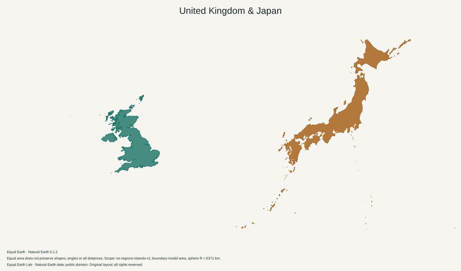
| Place | Boundary-model area estimate |
|---|---|
| A · United Kingdom | 242,737 km² |
| B · Japan | 378,248 km² |
Both silhouettes use one shared Equal Earth scale. Moving a silhouette here is a flat cutout comparison; it does not relocate the place on the globe. Shapes still reflect projection distortion. Try spherical relocation
Japan’s mapped area is 378,248 km², compared with 242,737 km² for the United Kingdom. Japan is 1.56 times as large. A convenient way to remember the relationship is that the UK covers a little under two thirds of Japan’s area.
Both countries are easy to recognise from a few large islands, and that familiarity can hide pieces of the comparison. A sketch of Great Britain is not a complete UK map. A sketch of Honshu is not a complete Japan map.
Great Britain, the United Kingdom and the islands nearby
Great Britain is the large island containing England, Scotland and Wales. The United Kingdom includes those three countries and Northern Ireland, as reflected in the Office for National Statistics country classification. Our UK outline includes their mapped offshore islands too.
Northern Ireland is the easily missed piece. It appears on a separate island to the west of Great Britain, so it disappears from a comparison that silently substitutes the largest island for the whole country. Conversely, colouring the entire island of Ireland as part of the UK would add territory that this comparison does not include.
The Isle of Man and the Channel Islands need a different distinction. The UK government’s Crown Dependencies explanation identifies Jersey, Guernsey and the Isle of Man as self-governing dependencies outside the United Kingdom. Their nearby location does not make them part of this UK area. Overseas territories are excluded as well.
These names matter more than they may seem to in a casual size analogy. “Japan versus Great Britain” and “Japan versus the United Kingdom” have different denominators.
Honshu is only part of Japan’s outline
Japan’s long central island, Honshu, provides much of the shape people recognise. Hokkaido adds a substantial mass to the northeast, while Kyushu and Shikoku add land to the southwest. The island chain continues toward Okinawa. Japan’s 2025 statistical handbook describes the archipelago’s northeast-to-southwest curve.
The largest continuous polygon in our Japan boundary file, corresponding to Honshu, measures roughly 229,000 km². That is already close to the UK’s roughly 243,000 km² in the same model. Adding the rest of Japan’s mapped islands explains much of the gap between the complete countries. This Honshu figure is a calculation from the site’s geometry, not an official island statistic.
A comparison that looks only at the two most familiar outlines can therefore give a very different impression from the complete set of islands shown above. Follow the separate pieces before judging the total.
Island chains leave a lot of water inside a map frame
The long spread of Japan needs room on the page. Some of that room is sea. A rectangular frame around the country would count the gaps between islands as if they were filled ground, overstating what the silhouette actually contains. The UK has its own gaps, especially around its northern and western islands.
The overlap control moves the second outline without resizing it. It is useful for seeing that the difference is substantial, but it does not turn the countries into matching shapes. Their coastlines, bends and island spacing remain different.
For a geographic view, open Japan on the world map, create a comparison copy and move it toward the UK. Keep Equal Earth selected when judging area. A switch to Mercator introduces an additional latitude effect as the copy moves north.
The closer comparison in this collection is Japan versus Germany. Germany’s area is much nearer Japan’s, despite the much greater difference in the appearance of their outlines.
Sources & further reading
Map calculations use the fixed dataset described in our methodology.