Australia vs the United States: which United States?
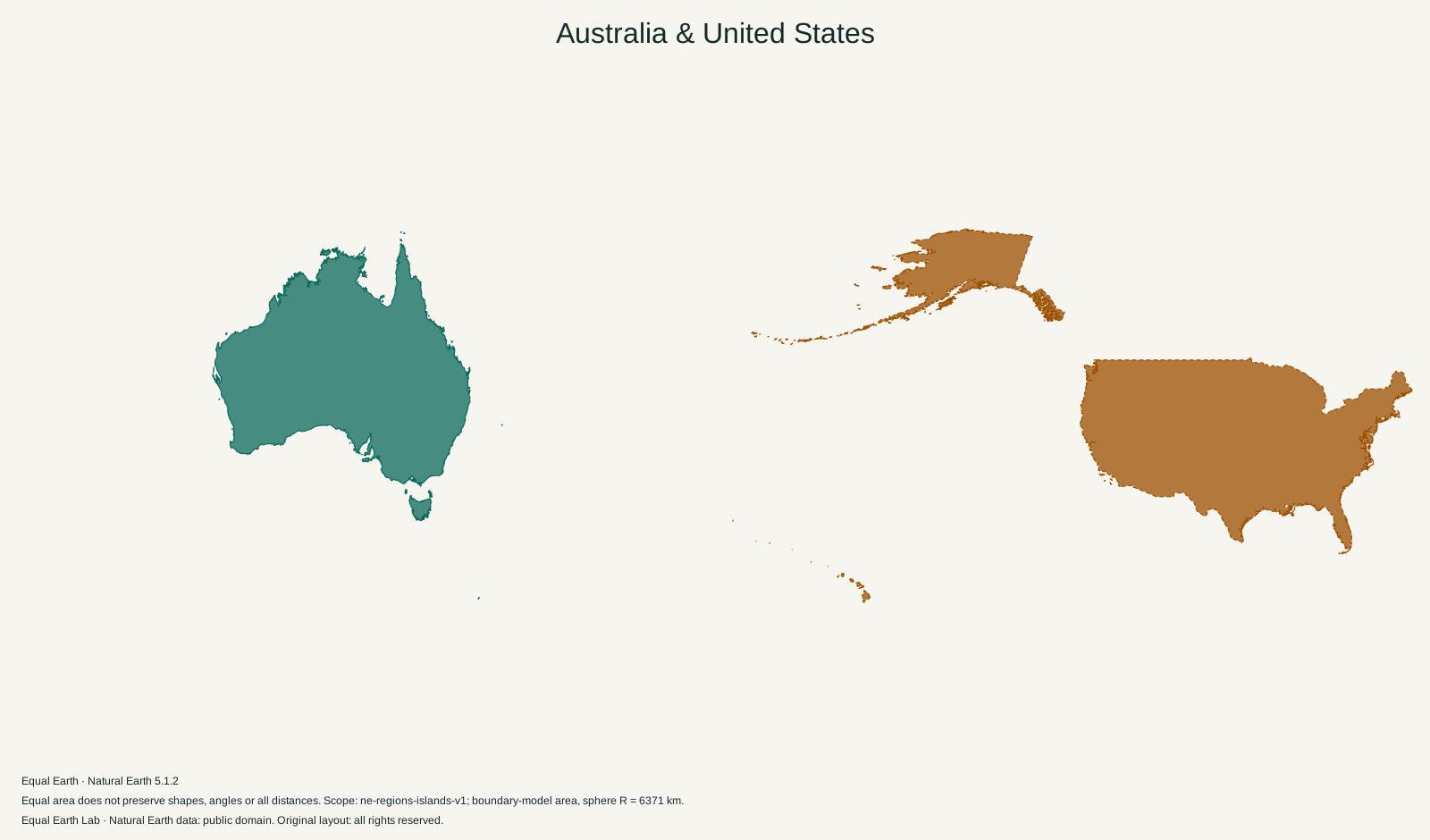
The United States is about 23 percent larger than Australia in our boundary model. That answer includes Alaska and Hawaii. The familiar comparison with the lower 48 is a much closer contest.
Australia is 0.82 times the boundary-model area of United States.
| Place | Boundary-model area estimate |
|---|---|
| A · Australia | 7,705,907 km² |
| B · United States | 9,447,826 km² |
Both silhouettes use one shared Equal Earth scale. Moving a silhouette here is a flat cutout comparison; it does not relocate the place on the globe. Shapes still reflect projection distortion. Try spherical relocation
“Australia is about the size of America” is a reasonable way to convey the scale of a continent to someone familiar with the United States. It becomes less useful as soon as the comparison is treated as an exact measurement. A map showing the contiguous states leaves out a substantial part of the country.
Here the American outline includes the 50 states and the District of Columbia. Its measured area is 9,447,826 km², compared with 7,705,907 km² for Australia. The United States is 1.23 times as large. Australia is about 82 percent of its size.
The state that cannot be left in the corner
Alaska is the reason the full-country comparison differs so much from a comparison of Australia with the lower 48. In the US Census Bureau’s 2010 state area table, Alaska accounts for about 1.48 million square kilometres of land. Hawaii adds a much smaller amount. Both belong in a comparison labelled “United States.”
A school atlas may put Alaska and Hawaii into small boxes below the contiguous states. Insets are useful because they make a national map fit on a page. But an inset can have its own scale. A reduced Alaska is especially misleading when the page is then used to judge the country’s total size against Australia.
Our outlines retain a shared scale. That leaves space between the American pieces, and the overall picture can look less tidy than a familiar inset map. Only the filled polygons count toward the area. The ocean between Alaska, Hawaii and the contiguous states adds nothing.
Why two sensible tables can give different answers
The Census table separates land from several categories of water. Subtracting Alaska and Hawaii from its United States row gives the following figures. These are calculations from the 2010 statistical table, separate from the map estimates above.
| US geography | Land area, km² | Total area including classified water, km² |
|---|---|---|
| 50 states and DC | 9,147,593 | 9,833,517 |
| Contiguous 48 states and DC | 7,653,005 | 8,081,867 |
Geoscience Australia reports Australia’s area as 7,688,287 km², calculated from its national coastline dataset. That puts Australia in the same broad size range as the contiguous United States. However, the American land and total-area columns lie on different sides of that Australian figure. The definitions need to be matched before making a precise “larger than” claim.
This is why the page uses one boundary dataset for the main comparison. Its polygons and treatment of inland water differ from those national statistical products. The extra digits in a table cannot resolve a mismatch in what the table measures.
Australia has separate pieces too
The Australian outline includes Tasmania, the island south of the mainland, and the coastal islands represented in the dataset. Separately mapped external territories and Antarctic claims are outside this comparison. On the American side, Puerto Rico, Guam and other territories are also outside the 50-state scope.
The result is an explicitly defined pair, rather than a competition between the largest possible interpretation of each country. If the question is about mainland Australia and the contiguous United States, it needs different outlines and a new calculation.
A useful way to read the overlap
Use Overlap silhouettes above and look first at the broad mainland shapes. Then follow the additional American pieces. Their placement explains why matching the countries’ overall widths would be a poor way to scale them.
For a view with their real neighbours, select Australia on the world map. Comparing across the Pacific also makes clear why an area analogy says little about travel: two places can cover similar amounts of ground while having very different arrangements of cities, coastlines and routes.
Sources & further reading
Map calculations use the fixed dataset described in our methodology.